Google Search Console is undoubtedly one of the most useful tools we have at our disposal to improve our performances. From the coverage report to the search result performances, the data at our disposal is wonderful. If you’re not using it, you’re seriously missing out.
That being said, the data provided are often incomplete or incoherent. And it’s important to understand the data you are using as a basis for your recommendations, to avoid taking bad decisions.
UI vs API
Most of you are surely familiar with the UI. You may also know that for big projects, you shouldn’t rely too much on it. Several issues:
- The UI won’t provide more than 1,000 rows, no matter what tab you are looking at. For instance, I have a property with more than 50,000 active URLs, and yet just 1,000 are shown. There is no workaround because even if you download the data using the “Export” button, you’ll be left with the same amount of data.

- Filters have been improved since RegEx are supported, but it’s still impossible to apply more than one filter to the same dimension.
- You can’t resample data per week or month. I usually compare weekly or monthly data. Daily data are impractical.
- You can’t display results for combined dimensions. For instance, you can’t export a table including top URLs per country. The only way to achieve that using the UI would be to filter by country (one by one!) and export data individually.
So yes, the UI is easy to access, but you must be aware of the limitations. The API removes almost of all these limitations, and you can choose the best option to use it based on your knowledge and workflow:
- Google Sheets: install this add-on and export your data directly into Google Sheets. A huge time-saver. Please note that you won’t be able to handle huge datasets, though, due to Google Sheets limitations.
- Python: Use this library, which is simple and does the job perfectly. If you’ve never used it before, be sure to follow this tutorial on how to set it up. I’m sure there are equivalents in other languages, but I cannot guide you as I’m only using Python.
- Manual setup: You can also create your own program to access the API. Just head over to the official documentation and try to follow the steps.
All dimensions are not equal
If you’re familiar with GSC, you already know that you have five main dimensions: date, page, device, country & query, The names are self-explanatory, and I don’t need to explain what they represent.
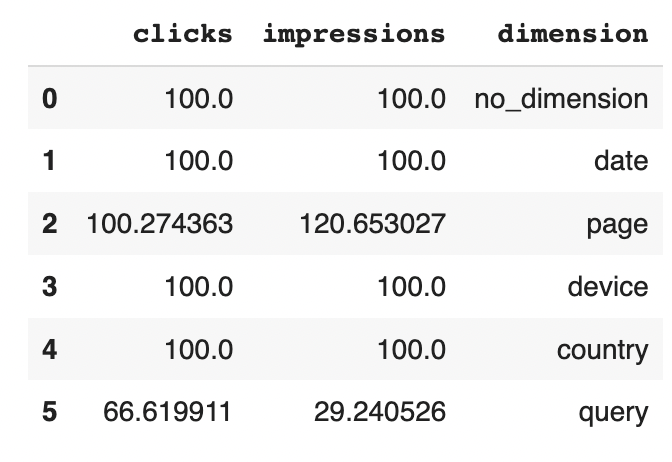
If you query one of these dimensions, and even if the API returns more than 1,000 rows, the total number of clicks & impressions can vary. For instance, when I included the query dimension, I ended up with only 66% of the clicks and 29% of the impressions. The (main) official answer for these discrepancies are anonymized queries. Not quite sure about this one, but even with this percentage, Google Search Console is still your best keyword database. Please note that this percentage may be higher or lower in your case, as highlighted by a recent study done by Ahrefs.
You can also be surprised by why I have 120% of my impressions when I include the page dimension. The explanation is actually simple: more than one URL can be displayed for a given query (especially on your branded terms) and hence inflate impressions.

Bottom line: do not forget that when you look at data grouped by query, you are actually looking at a sample. The rest seems accurate.
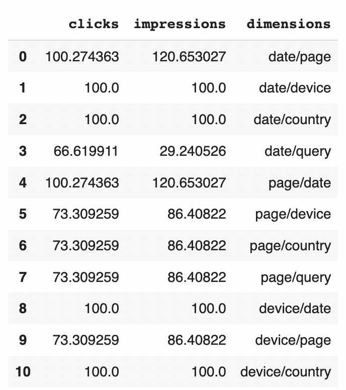
Now, what would happen if we combine two dimensions? I explained before that one of the main advantage of the API was to be able to combine dimensions. Does it impact the number of clicks and impressions returned as well? I created all possible combination and I ended up with the following results (see table below).
There are some obvious and not so obvious conclusions from this extraction.
- The order of the dimensions doesn’t matter. The results are the same if you retrieve the data for date/page or page/date. Might be obvious, but it has to be tested anyway.
- The second conclusion is the most counter-intuitive. When we retrieved data grouped by query, we got 66% (clicks) and 29% (impressions). When you add the page dimension, these values are increased to respectively 73% and 86%. This makes no sense. The jump for the impressions can be explained by queries displaying more than one URL, but the jump for clicks has no logical explanation.

Using properties for your folders makes sense
When Google announced the URL inspection API with a daily quota, one of the workarounds was to create one property by folder to increase it. Out of curiosity, I wanted to know if there was a discrepancy for clicks & impressions for:
- The main property, keeping only data for a specific folder
- The folder property
There is indeed! While the number of clicks is the same, the impressions are slightly higher for the folder property. I’d say that the folder property is more likely to return more data because the dataset is smaller. If you need to calculate CTR, you better use folder property. Because in this example, it goes from 4.3% to 3.9%.

Be careful with the average position
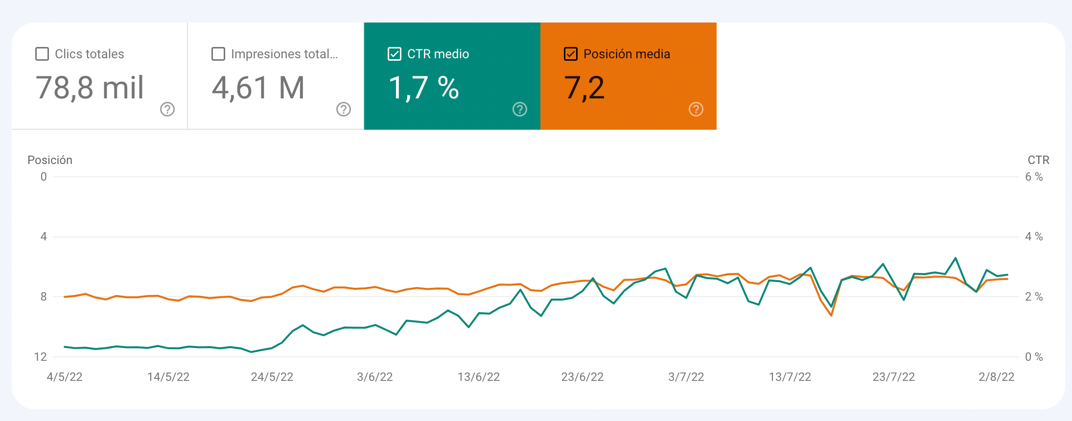
The average position in Google Search Console is often used to assess if a project is improving. It is sometimes useful: in the screenshot below, you can see that there is a correlation between the improvement in the average position and the CTR.

That being said, the average position is something I’d ignore, for several reasons:
- In a world where Google is adding more and more element in its SERP (from ads to modules), your CTR depends more on your pixel position than anything else. Therefore, the position is almost irrelevant
- Your average position can actually decrease if your results improve. Imagine that you start to rank 9th on a generic query: your impressions would go up, but your position may go down.
- In some industries, Google displays a module highlighting results from comparators & classified. Awesome, right? Well, not that much because any website including in this module will have a reported average position of 1 even if the CTR from this module is super low. Which, by the way, prevent you from building a relevant CTR yield curve with your data.

Conclusion
As we’ve seen, there are some details that you better understand when you use Google Search Console to prevent you from taking bad decisions. Does it mean that data are bad? Not at all! As I highlighted in my introduction, Google Search Console is still one of the best (and free) SEO tools that you can use to improve your results. You just need to know how to interpret the data you are looking at 🙂 .
